I have looked at thousands of websites since starting in the digital marketing space in 2011. My team and I have helped build over 100 gorgeous websites for our clients. We’ve worked with a variety of clients in a lot of different industries from pest control, dentists, gear manufacturing, body shops, plumbers, electrical contractors to (of course) a LOT of HVAC companies.







I have seen a website that a company charged their client $54,000 to make. Yeah, I know. I almost fell out of my chair. And the site has ZERO chance for ever ranking for anything. Ever.
I can’t tell you how many modern, sleek websites I’ve seen that end up being as useful as a rocking chair at making the phone ring.
However, I have seen incredibly simple, basic websites (like the two here) be workhorses for their companies.
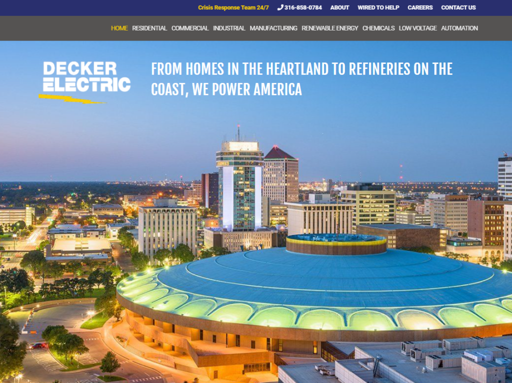
I can tell you with experience and certainty that your website needs THREE things to really be a soldier fighting diligently and tirelessly day and night to make you money.
#1: USEFUL CONTENT
What is useful content? It is information that solves a problem or in some way benefits the person reading it. It answers the immediate question and provides direction and help to learn more.
It’s pretty obvious where everyone is going with their questions – the internet. But what’s astounding is just how much traffic the internet gets, and more specifically – Google.
Google gets over three and a half BILLION searches a day.
Can you even grasp how much that is? It would take you 111 YEARS to simply count to 3.5 billion. And that’s how many searches Google gets each and every day!
These internet searchers aren’t coming to Google after consulting books or friends or even their handy uncle. Google is where people go FIRST. Once they suddenly have a question or a problem, people go straight to Google to find an answer. And often that means they are not yet in a position to pay someone to help.
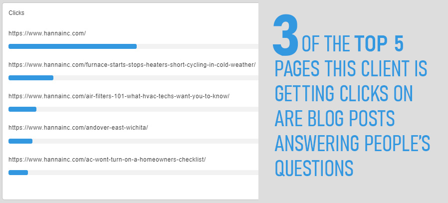
Fortunately there is a lot of low-hanging fruit here. The EASY searches to rank for, the one ones that can result in actual sales, is to be where your customers are. And that is with providing answers to their questions.
#2: TRUST
The purpose of your website is to build trust. Without trust your website is worthless.
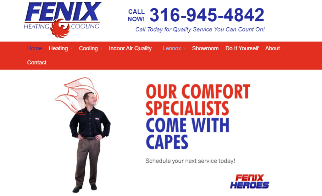
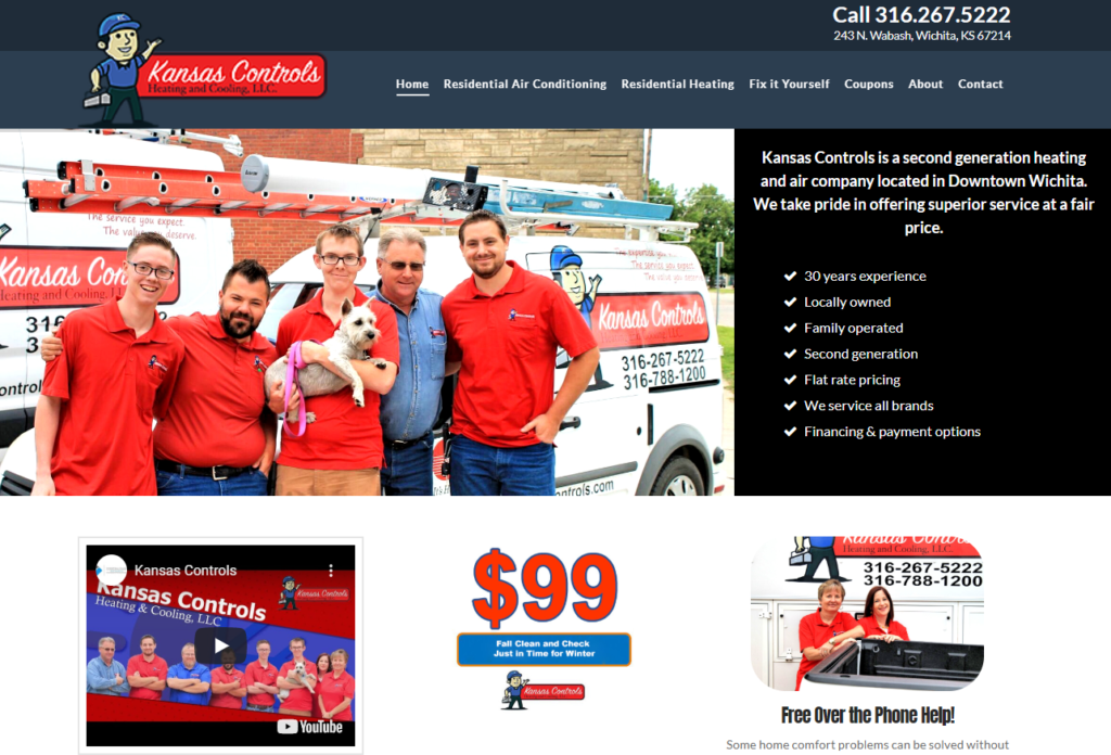
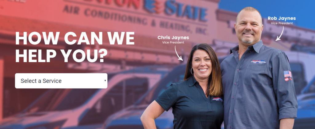
The absolute biggest, most knuckle-headed and frustrating thing I see when I look at an HVAC website is a lack of REAL PEOPLE. I’m talking about the real people who actually work at the company, not stock photos of models. And yes, web visitors can tell the difference.
People aren’t coming to your website thinking “I am sure this is a great company.” No. They are visiting you to see if you are indeed a company they can trust. They may be looking for signs that you offer fair pricing or that you have responsible technicians that they can trust inside their homes.
When people come to your website, you have less than a second (research shows it happens in two-tenths of a second) for them to either like or dislike what they see. Anything they see after that just reinforces that initial (possibly incorrect) impression they made about your company.
Nothing on God’s green earth is going to help them make a positive impression like seeing actual people. Using stock images, having confusing site navigation, lacking any pictures of trucks or technicians out in the field or working in the office… these are warning signs to those visitors that you might not be the best local company in town to handle their problem.
You need things like this.
#3: CALL TO ACTION
Lastly, and arguably most importantly, you need a call to action.
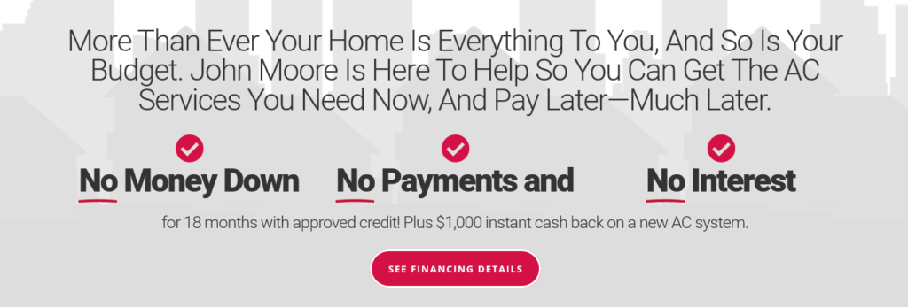
What is a call to action? It simply something on your site that makes it easy for a visitor to take another action toward contacting or hiring you. It’s clicking the phone number to call you or clicking on a chat box to ask a question. Perhaps it’s clicking on a special deal to save money on a service they need (which then gets them to call you for that service). A call to action is you taking them by the hand and TELLING THEM WHAT TO DO.
I can’t tell you how many HVAC websites I have looked at that basically just serve the function of being nice to look at… pretty postcards in a sea of webpages just floating around. Visitors don’t see a phone number or any temptation to take the next step. If you have useful content that speaks to their needs, if you have photos of real (smiling) people, then all you need to do is guide them to TAKE ACTION.
One of the best things about having an effective call to action on your site is it gives you something you can measure. I am sure you have heard the expression, if you can’t measure it, you can’t manage it. This is the KEY to marketing effectively and not throwing money at “advertising” and just hoping for the best.

HOW DO YOU COMPARE TO YOUR COMPETITION?
See exactly how your company compares to the big hitters in your market. You will be amazed at how big companies neglect the most basic things on their websites - which means big opportunity for you!
Sign Up for your free comparison report
