A
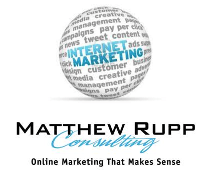
Where it says ‘internet marketing’ on the globe that will say ‘online marketing’ and the words around the globe will be buzz words I use all the time (be authentic, tell your story, be helpful, build links, call to action, help others) The fonts in the globe will match the bottom line. The globe ties in with the web. The globe looks good on social media sites, is unique and eye-catching. Will look good on shirts, cards, marketing materials. Might come off like a stock photo and not terribly professional?

B
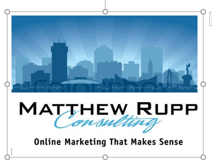
This could be some variation of a skyline. Could be in different colors or a generic city (not necessarily Wichita) I like that the city skyline ties in with the type of clients I work with. Dentists, electricians, body shops – businesses that serve their city and not worried about the whole world. Not as ‘fun’ or creative, I don’t think, as the one above. Too boring?

It’s down to the wire! Thanks for sharing your two cents. Please pick A or B and thanks for taking the time!
If there is anything I can do to help you please let me know,
Matthew
312-8181


Comments 4
I agree with many of your concerns regarding the logo – the biggest of which is that the R DOES look like a P. That factor throws the whole things off. All I can focus on is “what is that?” in the center of the globe. I think the arrow would possibly work if it blended more seamlessly with the “P” portion – same shade of blue, no exaggerated, overhanging lines. You should see the R first, then see the arrow (it needs to almost be invisible).
Another idea would be to use a rural city landscape in the background of your text – like a silhouette or shadow. It could be something filled in like the stock images found here: http://www.freepik.com/free-vector/city-skyline-silhouettes-pack_832726.htm#term=city&page=1&position=21
http://www.istockphoto.com/illustrations/silhouette-of-a-small-town?excludenudity=true&mediatype=illustration&phrase=silhouette%20of%20a%20small%20town&sort=best
Or something more simple like one of these (I’m picturing silos, mail boxes, small 2-3 story buildings, trees, etc.):
https://uk.pinterest.com/pin/575546027350047376/
https://uk.pinterest.com/pin/575546027350047380/
I love that idea! Thanks for the input. Makes a lot more sense than the globe.
Matthew – ‘A’ is great. ‘B’ is amazing! The only thing that would make me choose ‘A’ over ‘B’ is that the globe, and what it would contain, is explicitly about what you do. But ‘B’ is so appealing, and even more so (to me) because it’s recognizably Wichita. And what’s more down home than dentists, electricians, and body shop folks? :-) ….Just my 2 cents….love you…Momma
I like the globe but I am not crazy about the font on Consulting on either one. I don’t think it will copy well on shirts or logos